
Harriet Earle
Note from the author: This is my third article for Alluvium. These articles have been put together as a three-part introduction to key aspects of the comics form and, furthermore, how these aspects can be manipulated into narrative devices in their own right. I hope the readership of Alluvium have found these introductions useful. Even more so I hope I may have prompted some non-comics readers to give them a go.
Many aspects of the comics form have entered popular consciousness but none is quite as ubiquitous as the bubble. In order to work as a narrative form, comics are required to make visible many intangible things, most notably speech and thought. This is where the use of bubbles enters the form. On the most basic level, bubbles are containers for speech, thoughts or, sometimes, captions. They usually involve a directional pointer than links the bubble to the source. Traditionally, speech bubbles have smooth lines, connected directional pointers and a roughly oval shape while thought bubbles have a cloud-shaped outline and the directional pointer (several little ovals) is typically not connected to the bubble itself. So pervasive is the bubble that they have developed a cult ‘following’ of their own: one can declare their love of the bubble with such items as jewellery, notebooks and photo frames, all reinforcing the basic understanding that the bubble is a capsule for essential information.
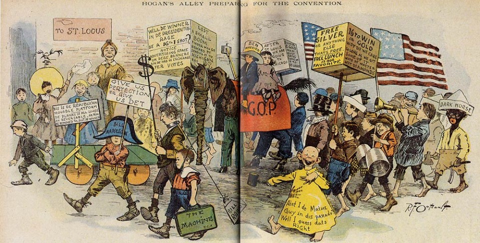
Bubbles were not always like this. In his classic 1985 study, Comics and Sequential Art, Will Eisner traces the origin of the bubble to Mayan friezes, in which a bracket is emitted from the speaker’s mouth to denote speech (2008: 25); these are called a ‘banderole’ or ‘phylactery’ and remained commonplace until the 19th Century (Petersen, 2011: xix). Comics historians generally consider The Yellow Kid to be one of the first comics characters. Initially his words appeared written directly onto his yellow nightshirt. However, as early as 1896, this was replaced with speech bubbles like the ones used commonly in contemporary comics. From its humble origins, the bubble has been developed over time so that the shape of the bubble has become a narrative device in its own right.
 Figure 1: Richard Outcault, 'The Yellow Kid' from Hogan’s Alley, c.1986.
[Images used under fair dealings provisions]
For example, jagged-edged bubbles can denote shouting, while wobbly-edged bubbles suggest a dreamy tone (or possibly inebriation). The contents of the bubble, too, can be used to illustrate features of the speaker. In Albert Goscinny and René Uderzo’s famous Asterix series, stereotypically recognisable fonts are used to show that characters are speaking in different languages, including Gothic and Norse. This technique is particularly effective when using characters from a wide range of language backgrounds as it quickly conveys to the reader that a foreign language is being spoken (we assume the lead characters’ native tongue is also ours and uses the default font).

Figure 2: Uderzo and Goscinny, Asterix and the Goths. Pilote Magazine, 1963.
[Images used under fair dealings provisions]
In some cases, images are used to represent words within bubbles. For example, a bubble may depict a cup of coffee, rather than a characters speaking the words ‘a cup of coffee, please’. The use of an image in the bubble changes the relationship that the reader has to the comic but given them far more power in the creation of the narrative than they have when the bubble contains words. We do not know if the image represents a demand, a request, a question or any other type of statement; it is for the reader to decide. Similarly, we do not know if it is coffee, tea or even soup – again, the reader decides. Furthermore, the use of an image removes any linguistic barrier that may exist. The example below (the image on the right) comes from a comic by Jason, a Norwegian artist, but does not require translation. The image introduces a universality that is not available to comics that include words.

Figure 3: Scott McCloud, Understanding Comics; Jason, ‘Untitled’ in Sshhhh! Seattle: Fantagraphics, 2002.
[Images used under fair dealings provisions]
Will Eisner calls the bubble a ‘desperation device [which] attempts to capture and make visible an ethereal element: sound’ (2008: 24). Why does Eisner consider its use to be a sign of desperation? In many of Eisner’s comics, the dialogue is an integral part of the image, artistically woven into the fabric of the panel. To encase dialogue within a bubble is to relegate it to encapsulation within blank space, segregating it from the rest of the panel. This changes the position of the dialogue; it can serve to create distance between the dialogue and the rest of the panel. Scott McCloud discusses the distancing implications of thought bubbles:
A thought caption – with or without borders – embodies each thought in a way that encourages us to assume ownership of it as we read. The thought balloon, just by virtue of its pointer, brings a third party into the relationship: the author, gently putting his hand on our shoulder and pointing to the face of the thinker with the words ‘he thought’ (2010: online).
By keeping thoughts constrained by thought clouds, rather than in, for example a voiceover-style caption, the creator places another boundary between himself and the reader. His thoughts do not become ours, as McCloud suggests a caption would allow, but the cloud reminds us starkly of the distance between the creator’s experience and our own. The implications for representations of trauma are crucial here. Not only is the bubble a central formal device, but it can be subtle, moving the reader in a way that is not obvious to them.
The written aspects of the comic, encased in bubbles, captions or voiceover boxes, are the part that most people read and, subsequently, what people think of when they think of reading comics. However, to read any comic relies on the reader adopting a new way of reading, which I propose we consider in terms of levels. The first level is the typical act of reading text – the basic comprehension of words. To this I would add the recognition of objects and people in drawn form. In comics, this level allows us the basic skill of reading dialogue and captions. The second level – that which is required for the reading of comics – is, for most people, an unconscious skill. This level involves an understanding of the demand of closure and the creation of a system of time. Though most seasoned comics readers will most likely not be aware that they employ any special skills in reading, this does not mean they are absent. I also add the recognition of comics-specific symbols, such as emanata and grawlixes to name two, as well as an awareness of conventions of the form.[1]
This way of reading is undermined entirely when we consider silent comics – comics in which there are no bubbles at all, and often few captions. In silent comics, the first level is removed as there is little or no text to read. The reader, then, is reliant entirely on their second-level skills and in order to construct a coherent narrative must work especially hard. Silent comics disrupt the standard methods of reading comics. By this definition, silent comics are particularly relevant for traumatic representation. The removal of first level reading skill is disorienting and liable to throw the reader completely off-balance, as we are so used to the presence of words in comics. This omission in itself can make the comic traumatic, the reader being to all intents and purposes diegetically stranded. Silent comics are relatively rare in Western mainstream publishing, which is still very much driven by the influence of the ‘house style’, standardising artistic technique. However, in trauma comics, silence is much more common, often for the simple reason that there is nothing to say. Silent comics allow the events to be presented without comment, involving the reader to a much higher degree.

Figure 4. Art Spiegelman's "In the Shadow of No Towers": the absence of speech bubbles in comics produces a reading which mimics the symptoms of traumatic rupture
[Image used under fair dealings provisions]
Keith Giffen and Bill Wray’s short comic ‘Dust’ is an excellent example of a silent comic that uses a linking motif to create narrative movement. It is not unusual for comics artists to use linking motifs, as writers do, to assist the reader in maintaining narrative flow but these are not usually present in all panels. Each panel of ‘Dust’ contains an image of discarded papers fluttering in the breeze. This persistence of images, in combination with the theme of the comic, speaks more of a traumatic repetition than a stylistic linking motif. Each of the three pages contains nine uniform panels, giving the comic an initial impression of being formally traditional. The panel transitions can be classified, for the most part, as being in McCloud’s fifth category: ‘aspect-to-aspect, [which] bypasses time for the most part and sets a wandering eye on different aspects of a place’ (McCloud 72). Thus, ‘Dust’ contains no discernible storyline. By the end of the comic, the reader has not completed a storyline as much as witnessed a small snapshot of a situation but with no commentary to explain the scenario or guide the reader in any way. The reader gains no information from the comic, remaining instead in a state of confusion and distress.
By this definition, silent comics are particularly relevant for traumatic representation. As can be seen in the image above, Art Spiegelman's autobiographical 2004 comic strip In the Shadow of No Towers similarly represents the collapse of the WTC towers with a central silent panel whose large size recalls the panels from the early 20th century. The non-linguistic possibilities afforded by such silent panels reveal comics' ability to offer 'one of the most effective ways to express emotion, especially emotions related to a complicated and painful disaster' (Witek 235). The removal of first level reading skills is disorienting and liable to throw the reader completely off-balance, as we are so used to the presence of words in comics. This omission in itself can make the reading of the comic ‘traumatic’ (i.e. the experience of reading mimics the symptoms of the traumatic rupture). However, in ‘Dust’ this is compounded by the uncommon panel transitions and a muted colour palette. The comic uses very few colours, predominantly grey and pale brown, mimicking the title in the choice of colour. The drawing style, too, is unusual. The drawings are a mixture of soft-lined, slightly blurred images and harshly outlined images. There is some hatching and shading but this aside, the style is reminiscent of ligne claire.[2] Many of the panels are only partially bordered so, while the overall look of the comic is in line with traditional uniform style, on closer inspection there are many formal rules broken. As with so many other trauma and conflict comics the disjunction between form and content jars and creates a mood of unease and distress that mimics traumatic experience. By the end of the comic, the reader has not completed a storyline as much as witnessed a small snapshot of a situation but with no commentary to explain the scenario or guide the reader in any way. The reader gains no information from the comic, remaining instead in a state of confusion and distress.
In comics with bubbles, the bubble conveys speech, thought and sound to create narrative flow and allow the reader to navigate through the text. In silent comics, the bubbles are conspicuous by their absence and leave disorientation in their wake. The comics creator must find another way to move the narrative forward using image alone. It is in these comics that the specific skills required to read and, more importantly, understand comics become apparent and, sometimes, are stretched.
CITATION: Harriet Earle, "Framing Comics Words," Alluvium, Vol. 3, No. 2 (2014): n. pag. Web. 17 October 2014. http://dx.doi.org/10.7766/alluvium.v3.2.02
[author] [author_image timthumb=’on’] http://www.alluvium-journal.org/wp-content/uploads/2011/12/40684_540146896858_6907120_n1.jpg[/author_image] [author_info] Harriet Earle is a first year PhD student at Keele University, under the supervision of Dr James Peacock and Dr Tim Lustig. Her research focuses on traumatic representation and conflict in American comics published since the end of the Vietnam War. [/author_info] [/author]
Notes:
[1] ‘Emanata’ refers to the lines around a character’s head to indicate shock, drunkenness or any other number of emotions and states. ‘Grawlixes’ are typographical symbols used to replace words, usually expletives. Both terms were coined by Mort Walker in The Lexicon of Comicana (2000).
[2] The term Ligne Claire comes from Dutch cartoonist Joost Swarte (originally rendered Klare Lijn) and his 1977 exhibition in Rotterdam (Miller 2007: 18). However, the style is synonymous with the Franco-Belgian bandes-dessinées tradition and more specifically Belgian comics artist Hergé. This style ‘privileges smooth, continuous linework, simplified contours and bright, solid colours, while avoiding frayed lines, exploded forms and expressionistic rendering’ (Hatfield 2005: 60).
Works Cited:
Eisner, Will. Comics and Sequential Art (New York: W. W. Norton, 2008).
Giffen, Keith and William Wray. ‘Dust’ in 9-11: World's Finest (New York: DC Comics, 2002), pp. 111-113.
Hatfield, Charles. Alternative Comics: An Emerging Literature (Jackson: University Press of Mississippi, 2005).
McCloud, Scott. (1994) Understanding Comics: The Invisible Art. (New York: HarperPerennial, 1994).
McCloud, Scott (2010) ‘That Hand on Your Shoulder’. Available at: http://www.scottmccloud.com. [Accessed on 2nd March 2013].
Miller, Ann. Reading Bande Dessinée: Critical Approaches to the French-language Comic Strip (Bristol: Intellect, 2007).
Petersen, Robert. Comics, Manga and Graphic Novels: A History of Graphic Narratives (Santa Barbara: ABC-CLIO, 2001).
Walker, Mort. The Lexicon of Comicana (Bloomington: iUniverse, 2000).
Witek, Joseph (ed.). Art Spiegelman: Conversations (Jackson, MS: The University Press of Mississippi, 2007).
Please feel free to comment on this article.